week_1 | 'data analysis' | 7/23/2025
Before we dive into the actual machine learning, we first need to be familiar with data. Prior to making predictions of unknown data, it's crucial to be able to work with and manipulate the data we already have. But, where do we find data?
There are numerous online sites that have thousands of publicly available datasets like Kaggle and Google's Dataset Search.
Or, you can always source your own data through web-scraping or connecting to an API.
In order to practice working with large datasets, I personally decided to explore a dataset of professional tennis matches I found on Kaggle (ATP Tennis Dataset).
My goal going into this was to become more comfortable utilizing data-driven python libraries. For this project, I'm using pandas, Matplotlib, and seaborn.
Pandas is a data manipulation tool most known for its DataFrame object. Dataframes are two-dimensional data structures that function similarly to a spreadsheet. Matplotlib is a tool used for plotting data and seaborn is an extension that builds on matplotlib that makes it much simpler to produce visually appealing graphs.
The dataset I'm using includes csv files of every year of every ATP match in the open era (1968-2024). For each match, common information like location, date, players, and more are stored. After importing the necessary libraries, I began loading all of the data from each csv into a DataFrame (commonly abbreviated as df).
for year in range(1969,2025):
df = pd.concat([df,temp_df])
In order to check that the data was properly loaded, I used df.head() to visualize the first n rows (n=5 by default).
tourney_id tourney_name ... loser_rank loser_rank_points
1 1968-2029 Dublin ... NaN NaN
2 1968-2029 Dublin ... NaN NaN
3 1968-2029 Dublin ... NaN NaN
4 1968-2029 Dublin ... NaN NaN
Because this dataset runs back to 1968, some stats weren't consistently recorded. This explains the NaN (Not a Number) entries in the DataFrame. Luckily, the only stats that seemed to be missing were more obscure and I didn't end up using them in my analysis. However, if I were to use this data, I'd have to first clean it by removing the unwanted rows.
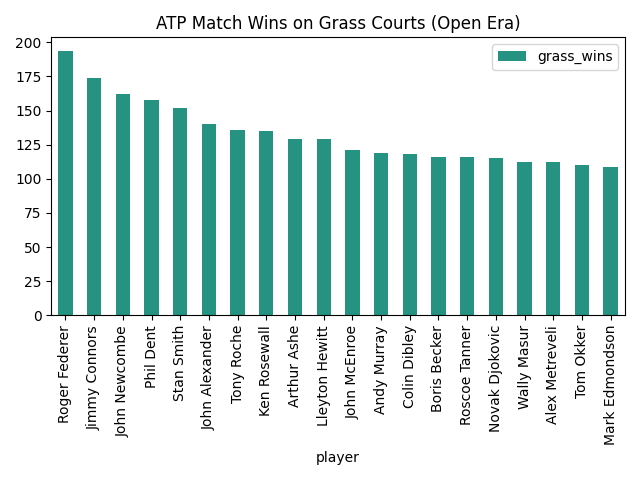
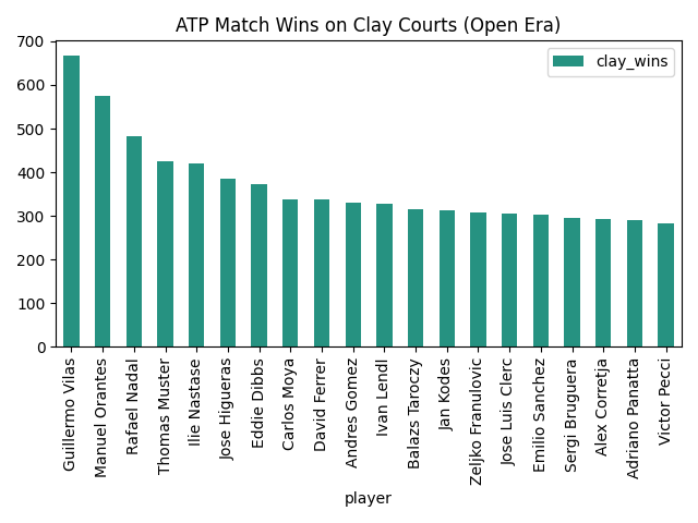
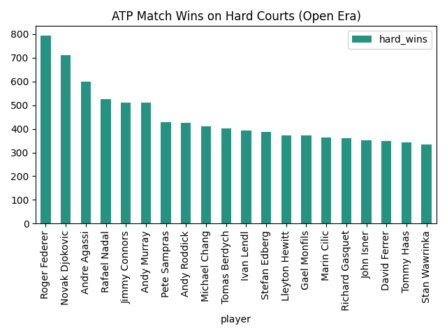
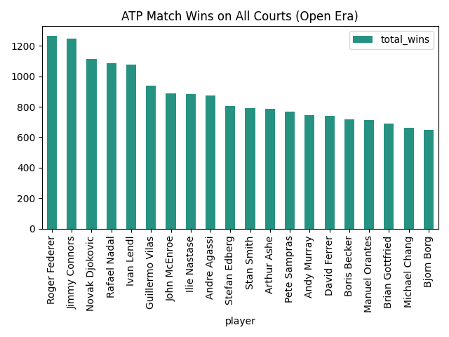
For my first plot, I wanted to explore what player was the most successful on each surface type. In order to ensure that my DataFrame doesn't lose any of its columns, I chose to create a new DataFrame based on the number of wins on each surface of each player.
surface_stats_df = pd.DataFrame(
"hard_wins": surface_wins.get('Hard'),
"grass_wins": surface_wins.get('Grass'),
"clay_wins": surface_wins.get('Clay'),
"carpet_wins": surface_wins.get('Carpet'),
"total_wins": surface_wins.get('Hard') + surface_wins.get('Grass') + surface_wins.get('Clay') + surface_wins.get('Carpet')})
Following this, I constructed individual DataFrames for each major surface and sorted them in a descending order based on the number of wins (I chose to ignore carpet matches because of how few there are). I also chose to include only the top 20 players in each category to make the graphs more readable.
grass_stats = surface_stats_df.sort_values('grass_wins',ascending=False).iloc[:20,:]
clay_stats = surface_stats_df.sort_values('clay_wins',ascending=False).iloc[:20,:]
hard_stats = surface_stats_df.sort_values('hard_wins',ascending=False).iloc[:20,:]
total_stats = surface_stats_df.sort_values('total_wins',ascending=False).iloc[:20,:]
It was now finally time to display this data on graphs. For these first couple, I chose to stick with plain matplotlib and wait to use seaborn later. I wanted to start out simple and build from there.
clay_stats.plot(x='player', y='clay_wins', kind='bar',color='orange',title='ATP Match Wins on Clay Courts (Open Era)')
hard_stats.plot(x='player', y='hard_wins', kind='bar',color='blue',title='ATP Match Wins on Hard Courts (Open Era)')
total_stats.plot(x='player', y='total_wins', kind='bar',color='red',title='ATP Match Wins on All Courts (Open Era)')
After getting a cleaner visual of the top players, I figured it was time to learn a little more about them and I started asking questions. How old are these players? Where are they from?
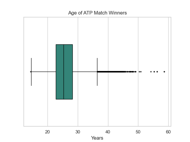
I first looked at ages. I found the average age of an ATP match winner, the oldest player to evern win an ATP match, and the youngest. In order to find these, I used the built-in pandas methods mean(), max(), and min().
oldest_win_age = df['winner_age'].max()
oldest_winner = df.loc[df['winner_age']==oldest_win_age]['winner_name']
youngest_win_age = df['winner_age'].min()
youngest_winner = df.loc[df['winner_age']==youngest_win_age]['winner_name']
I found that the average age of an ATP match winner is 25.7 years old.
The oldest winner is Anthony Billington who was 58.7 years old when he won.
The youngest winner is Laith Azzouni who was 14.3 years old when he won.
This information led me down a long rabbit hole of digging into who these players were since I'd never heard of them. I struggled to find much information on either and the few claims that I did find were often conflincting. This revealed a crucial part of analysis, data validation. While this dataset was able to reveal general trends in the world of tennis, It's crucial that specific data is validated before it's used to make any real claims or predictions.
Now that I've extracted a few key ages, I wanted to plot this information. I opted to use a boxplot as it would enable me to clearly display the min, max, and mean ages along with a more general IQR. I also figured it would be a good time to test out seaborn.
fig1 = sns.boxplot(data=df['winner_age'],orient='h',width=.5,fliersize=2,color="#269281")
fig1.set(title='Age of ATP Match Winners',ylabel='',xlabel='Years')
Next up, I wanted to explore the number of wins from each country. I decided to go with a bar plot once again. However, this time I'll be constructing it using seaborn.
fig2 = sns.barplot(data=country_win_stats[:20],orient='h',color="#269281")
fig2.set(title='ATP Match Wins by Country',ylabel='Country',xlabel='# of Match Wins')
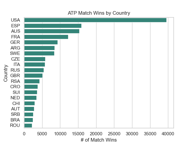
After first plotting this data, I was quite shocked at how far ahead the United States was in terms of match wins compared to every other country. Many of the top players like Federer, Djokovic, and Nadal are European and it's pretty rare to see a lot of American Players at the very top. So, I decided to look further into why this could be.
I hypothesized that there was a lop-sided number of players competing from each country. So what better to do than to figure out if that's true.
I loaded in another csv file dedicated to every player and extracted what country they play for.
players_per_country = df_players.groupby(['ioc']).size().sort_values(ascending=False)
other_players = players_per_country[15:].sum()
players_per_country = players_per_country[:14]
players_per_country.loc['Other'] = other_players
fig3 = players_per_country.plot(kind='pie', title='% of Players from each Country',colormap=cm)
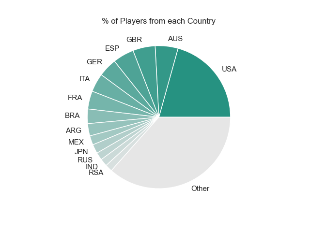
After plotting this data, It became quite obvious that my speculations were correct. While the United States has the most wins of any nation, it also has the most players of any nation by a lot.
With this final graph, week 1 was coming to an end. I've had a great introduction to data visualization and manipulation in python and I feel prepared to transfer these skills to more complex techniques. While I'm still no data scientist, I'm excited to grow my skills even further with future projects. I published all of the code I used for this introduction on GitHub if anyone wants to check it out.
-Logan Thomley